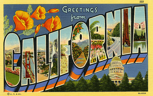
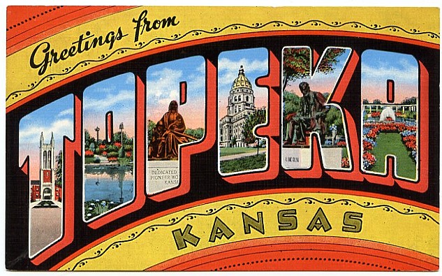
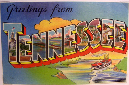
Note the ascending text and the groovy block colors. The capital building overlap is also quite nice…
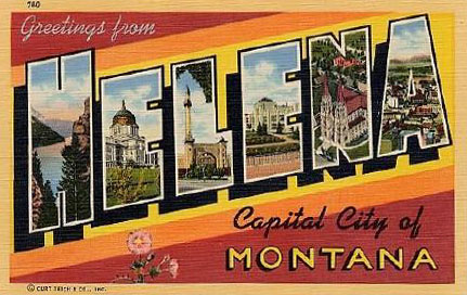
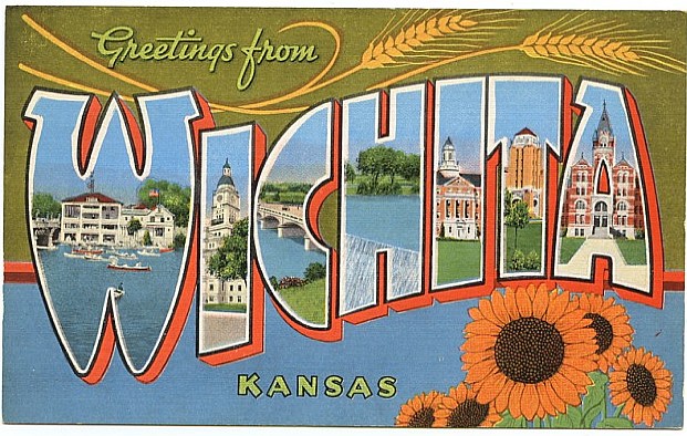
The text here is chiseled hard — tons of big space for the actual mask, with a sharp graphic background
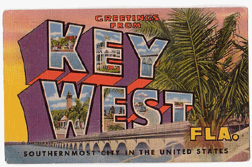
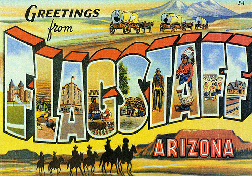
Here the text is stacked, and the block text enhances the sense of perspective; the palm creates a strange illusion
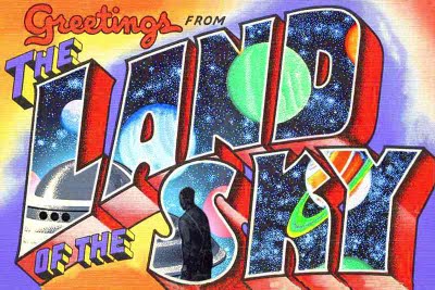
A humorous take with some interesting distortions, and a narrative of some sort?
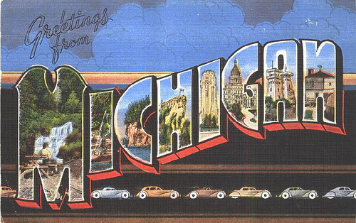
The black backdrop really gives the sense that we are seeing through a window — note what is being depicted
Let’s put masking techniques to work
In-class demo images:
The Weekend Project
The “large letter” postcards depicted here represent a classic technique still used in the creation of postcards. Typically accompanied by the “Greetings From” text, we find large letters with the name of some exotic (or not-so exotic location).
The design is particularly interesting because it allows many views onto a single location, without the need for complex “blurs” or overlaps. The text becomes a device with a hard edge, and in some cases, even the opportunity to tell a story through several vignettes.
The Challenge
Bearing these issues in mind (as well as the cult status of these cards), in this mini-project you will create a “large letter” postcard that uses your name and introduces you as a designer.
Yes, who are YOU as a designer? We’ve talked about computers and software and how they play a big role in defining the “look” of design, but use this postcard to show what YOU bring to design that is UNIQUE.
Use the vignetted letters to highlight your interests, concerns, curiosities, or whatever you find to be relevant. I should be able to get a sense of what you “bring to the table” as a designer.
Please also use the “Greetings From” text as a part of your design.
One note — for those with “shorter” names — if your name is only five letters or shorter, please also incorporate your last name.
Specifics
Beginning in Photoshop, create a new file that is 8″ wide by 5″ high, at 100 DPI.
Add the necessary text, and use the masking techniques we have discussed today in order to create your design. Use whatever photos you like for the masking. It could be album art, personal photos, your past design-work, whatever you see as integral in defining who you are as a designer.
If you are up for the challenge, be sure to think about “masks within masks,” in other words, you can create montages within the actual letters.
The background elements are up to you — think about how you might use this area to enhance the piece, or perhaps even incorporate additional masks. As mentioned above, please include the “GREETINGS FROM” text in this design…
For more examples — take a look at Cardcow’s website.
There are still other possibilities here — consider, for instance, making the card appear weathered or aged? Creating a narrative that unfolds between the letters? Using different text effects to set a mood?
Also, when you look at these examples, note that in many cases they are actually really stunning designs — all of them pre-Photoshop! So, how can you create a full look that fits into this rich tradition?
If you have an Adobe Creative Cloud account, you have access to thousands of fonts. Take a look at the Adobe Fonts website. Lo-in with your Adobe account, and you’ll be able to sync them to your computer. If you want to go beyond that, or don’t have an Adobe CC account, a classic spot to search for typefaces is dafont. Other font sites with free fonts include Lost Type Co-Op, Google Fonts, and Font Squirrel to name a few. You are welcome to use these sites, but take note of some licensing restrictions (especially for the future!). Look at “Condensed” fonts, in particular, which are designed to be large, without taking a lot of space. Make sure the letters are bold enough to actually highlight your imagery.
Please upload a JPEG/PNG version of your file to the class discussion in CI Learn before the START of the next class.
Also, bring in the actual Photoshop file, as I will want to see all of your “masking” in action…
